
C+E Studio Visual Support

Project Journey: After several attempts to unify the studio branding by the internal team and another attempt by another freelance designer, nothing was landing that my senior manager liked.
The Project: Start with a small internal deck design, I then created a 68 slide deck that could be used for all of the potential design needs within the studio. We extended the design into the studio website, Figma needs as well as prep for the incoming Slides application.
My Role: I was responsible for creating all of the assets in this section. Creative input from 3 different leads to crate assets for their individual teams.
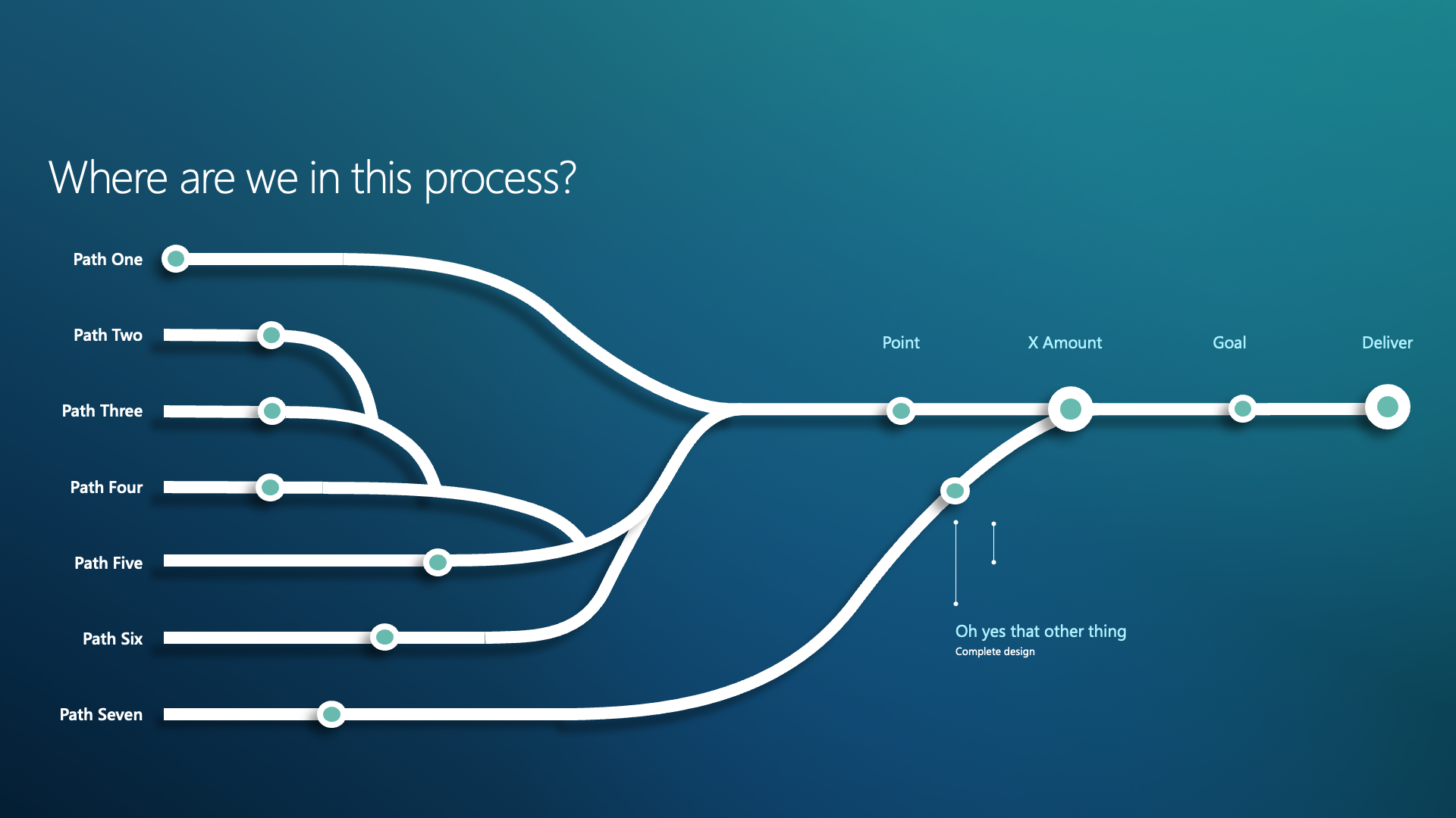
Existing issues we needed to overcome.


Four different problems we need to solve for.
1) A new template that was using light pinks, blues and purple… Our higher level managers didn’t feel that the decks were bold enough and left people feeling unimpressed.
2) Persona icons from using MSFT Brand colors - human illustrations is always a challange as soon as we start trying to identify, race, color and gender. (still not a solvable problem)
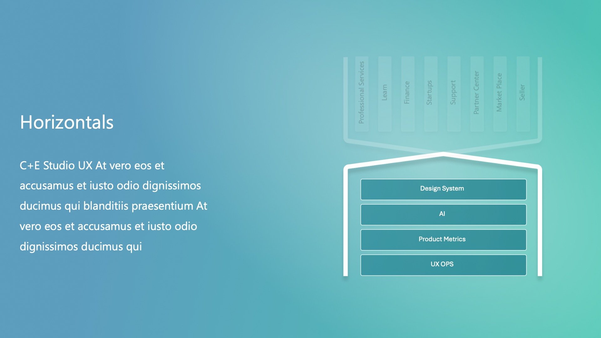
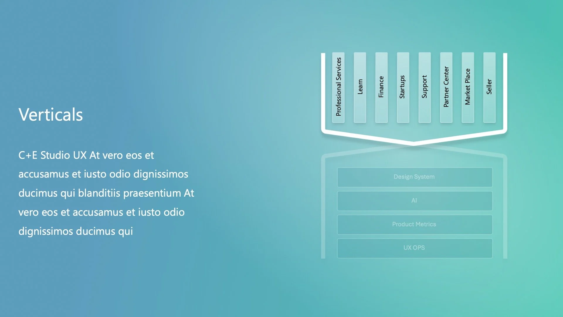
3) Generic layouts that were not relevant or couldn’t be adjusted to fit the complexities of our layouts for Research, Design or PM partners
4) Two different icon styles - one was graphic with lots of textures and had a bit of an 80s feel. The other newly launched it has a interesting 3D feel, but is busy and a little bit of it goes a long way.
The first thing we worked on was a brief deck for the studio, intended for frequent use. If we could perfect this, it would serve as our starting point.
Experimental design


In the end this simple graphic was a hit and the heavy white lines were used through out the rest of the toolkit in addition to isometric versions.

Once we had this basic layout we could expanded it to a larger studio template. The problem we have with templates is that everyone has different needs depending on their role and types of slides. I set this one up to have only the the backgrounds on the template and everything else just needed to align to the grid.
A few sample slides of the 80 differently layouts - a 12 column grid and horizontal marks based on the Fibonacci sequence and a type ramp.


In our ongoing efforts to create a more inclusive and authentic user experience, we have transitioned from using detailed illustrations of people to incorporating actual photography for our UX personas and walkthroughs. In situations where a photo is to large we have added some simple line icons.
Rationale:
Avoiding Stereotypes: While our illustrations aimed to represent diverse skin tones, they sometimes inadvertently reinforced stereotypes. By using real photographs, we can better capture the true diversity and individuality of our users.
Human Connection: Photographs add a genuine human touch, making our personas and walkthroughs more relatable and engaging. This change helps users see themselves reflected in our designs, fostering a stronger connection.
Visual Appeal: The beauty and realism of photography enhance the overall aesthetic of our project, providing a richer and more immersive experience.
We believe this shift not only improves the visual quality of our work but also aligns with our commitment to inclusivity and authenticity.


This lead to move options and style that is easy to expand upon as we more


Next Steps:
Figma Integration: We have added this library of photographs to Figma, allowing team members to easily incorporate them into flows and other presentations.
Mockup Components: UX low and mid-fidelity mockup components have been created to facilitate the design process.
Presentation Update: We have started rebuilding the PPTX deck to transition it into a Slides presentation, in preparation for Microsoft’s upcoming changes.


